You know that feeling when a store sign makes you stop and stare? That kind of pull doesn’t happen by accident. At our Sign Shop, we’ve tested all sorts of materials, lighting tricks, and design tweaks—some were hits, some were misses. In this post, I’ll run through the top pointers for picking the right base, crafting a memorable look, lighting it up, keeping it fresh, and getting it hung without drama.
Key Takeaways
- Pick materials that can handle rain, sun, and wind and still look like you.
- Combine big letters, clear colors, and simple 3D parts to catch the eye.
- Position LEDs for an even glow and choose low-watt bulbs to cut power bills.
- Clean signs regularly, fix small damage fast, and call pros when you spot trouble.
- Let your Sign Shop do the site checks, grab the right permits, and install with no mess.
Selecting Durable Materials At Your Sign Shop
When it comes to signs, what they’re made of is super important. You want something that looks good, but also lasts. Think about it – a sign is often the first thing people see, so it needs to make a good impression and stick around for a while. Let’s get into the nitty-gritty of picking the right stuff.
Choosing Weather-Resistant Substrates
Okay, so weather is a big deal. You need materials that can handle whatever Mother Nature throws at them. We’re talking rain, sun, snow, and wind. Some popular choices include:
- Aluminum: It’s lightweight, doesn’t rust, and you can paint or laminate it. Great for outdoor signs.
- MDO (Medium Density Overlay): This is basically plywood that’s been treated to resist the elements. It’s smooth, easy to paint, and won’t break the bank.
- Acrylic and Plexiglas: These are good for a clean, modern look and can stand up to different weather conditions. They’re often used for illuminated signs.
Picking the right material can save you money in the long run. Cheaper stuff might need replacing sooner, which means more hassle and expense.
Exploring Sustainable Material Options
More and more people care about the environment, and that includes businesses. Using sustainable materials is a great way to show you’re doing your part. Here are some ideas:
- Recycled aluminum: It’s just as good as regular aluminum, but it’s made from recycled materials.
- Wood from sustainable forests: Look for wood that’s certified by the Forest Stewardship Council (FSC).
- Eco-friendly paints and coatings: These don’t have as many harmful chemicals.
Matching Finishes To Brand Identity
The material isn’t the only thing that matters; the finish is also key. It needs to match your brand’s vibe. For example:
- Matte finishes: These are good for a subtle, sophisticated look.
- Glossy finishes: These are eye-catching and modern.
- Textured finishes: These can add depth and interest.
Here’s a simple table to illustrate how different finishes can affect the overall look:
| Finish | Look | Best For |
|---|---|---|
| Matte | Understated | Professional services, high-end boutiques |
| Glossy | Eye-catching | Retail stores, restaurants |
| Textured | Unique, Rustic | Craft shops, outdoor businesses |
Think about what you want your sign to say about your business, and then pick a finish that helps you say it.
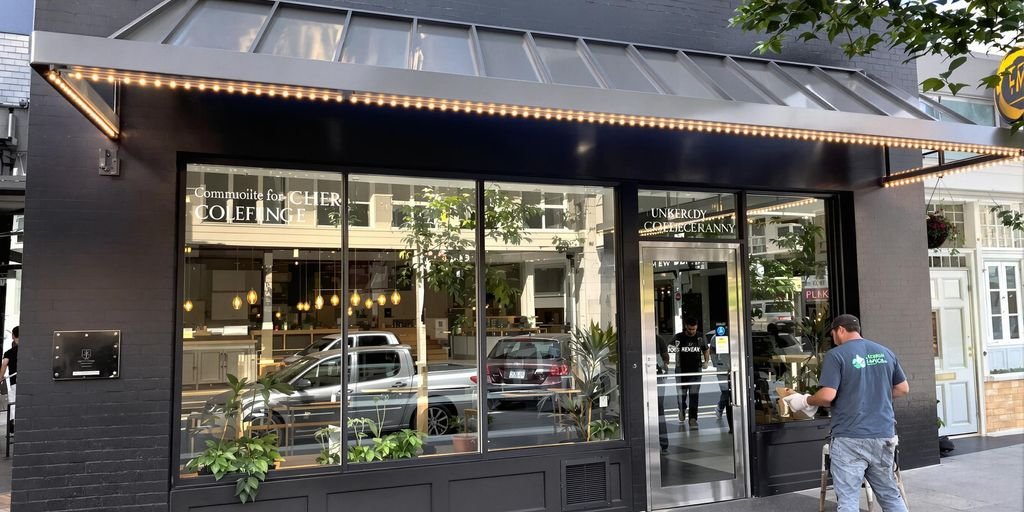
Crafting Eye-Catching Outdoor Displays
Outdoor displays are your business’s handshake with the world. It’s the first impression, the silent salesperson, and the 24/7 advertisement all rolled into one. But how do you make sure your outdoor display isn’t just visible, but truly eye-catching? It’s about more than just slapping a logo on a board; it’s about creating something that draws people in and makes them want to learn more. Let’s explore some key elements.
Incorporating Bold Typography
Typography is more than just choosing a font; it’s about crafting a visual language. Your font choice should reflect your brand’s personality and be easily readable from a distance. Think about it: someone driving by only has a few seconds to register your sign. A script font might look pretty up close, but if it’s illegible from the road, it’s useless. Consider these points:
- Use fonts with clear, simple shapes.
- Ensure adequate spacing between letters.
- Choose a font weight that’s bold enough to stand out.
Balancing Color Contrast And Readability
Color is powerful, but it can also be tricky. A poorly chosen color scheme can make your sign difficult to read, or even worse, visually unappealing. The key is to find a balance between contrast and readability. High contrast color combinations, like black on yellow or white on blue, are generally the easiest to read. But don’t be afraid to experiment with other color combinations, just make sure they’re easy to read and align with your brand’s aesthetic.
Think about the environment where your sign will be placed. Will it be in direct sunlight? Will it be surrounded by other colorful signs? These factors can all affect how your sign appears, so it’s important to take them into account when choosing your color scheme.
Integrating Three-Dimensional Elements
Flat signs are fine, but three-dimensional elements can really make your display pop. Consider using 3D signs or dimensional lettering to add depth and visual interest. This could involve anything from raised lettering to custom-shaped elements that reflect your brand. For example, a bakery might use a 3D cupcake as part of their sign, or a car repair shop might use a wrench. The possibilities are endless, and the impact can be significant. Here’s a quick comparison:
| Feature | Flat Sign | 3D Sign |
|---|---|---|
| Visual Impact | Moderate | High |
| Memorability | Average | High |
| Cost | Lower | Higher |
| Installation | Easier | Complex |
Illuminated Signage Techniques From A Sign Shop
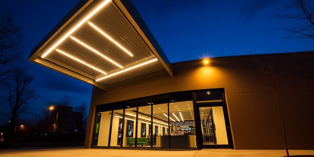
Let’s talk about making your business shine, literally! At our sign shop, we’re always experimenting with new ways to light up your brand. It’s not just about slapping some lights on a sign; it’s about creating an experience, drawing attention, and making a lasting impression. We’ve seen it all, from simple backlit signs to complex, multi-layered illuminated displays. Here’s a peek into some of the techniques we use to make your signage stand out.
Optimizing LED Placement For Uniform Light
Getting even light distribution is key. Nobody wants a sign with hot spots or dark patches. We spend a lot of time figuring out the right spacing and density of LEDs. It’s a bit of a science, really. We consider the sign’s size, the material’s thickness, and even the color of the graphics. For example, a sign with darker colors might need more LEDs to achieve the same brightness as a sign with lighter colors. We also use diffusers to help spread the light more evenly. It’s all about creating a smooth, consistent glow that’s easy on the eyes. Proper LED placement ensures your message is clear and visible, day or night.
Utilizing Backlit Versus Frontlit Options
Backlit and frontlit signs offer totally different looks. Frontlit signs are what most people think of when they picture an illuminated sign – the light shines directly out from the front. They’re bright and attention-grabbing. Backlit signs, on the other hand, have a more subtle, sophisticated feel. The light shines from behind the letters or graphics, creating a halo effect. This can look really classy, especially on darker backgrounds. The choice really depends on your brand and the message you want to send. Here’s a quick comparison:
| Feature | Frontlit Signs | Backlit Signs |
|---|---|---|
| Brightness | High | Medium |
| Visual Impact | Bold | Elegant |
| Best For | High-traffic areas | Upscale businesses |
| Installation | Simpler | More complex |
Adopting Energy Efficient Lighting Solutions
We’re big on sustainability. Energy efficiency isn’t just good for the planet; it’s good for your wallet too. That’s why we almost exclusively use LEDs in our illuminated signs. LEDs use a fraction of the energy compared to traditional lighting options like neon, and they last way longer. This means lower electricity bills and less frequent maintenance. Plus, LEDs are available in a wide range of colors and brightness levels, so you don’t have to sacrifice aesthetics for efficiency. It’s a win-win.
Switching to LED lighting for your signage is one of the easiest ways to reduce your business’s environmental impact and save money at the same time. It’s a smart investment that pays off in the long run.
Ensuring Longevity With Sign Maintenance
Outdoor signs are a big investment, and like any investment, you want them to last. Neglecting maintenance can lead to faded colors, broken parts, and an overall unprofessional look. Let’s talk about how to keep your signs looking their best for years to come.
Developing A Regular Cleaning Schedule
Think of your sign like your car – it needs regular washing! Dirt, grime, and pollutants can build up over time, dulling the colors and making the sign harder to read. The frequency depends on your location. A sign near a busy road will need more frequent cleaning than one in a quiet area. Here’s a basic schedule to consider:
- Monthly: Light dusting or wiping down with a soft cloth.
- Quarterly: A more thorough cleaning with mild soap and water.
- Annually: Professional cleaning and inspection.
Always use cleaners that are safe for the sign materials. Harsh chemicals can cause damage.
Identifying And Repairing Damage Early
Small problems can quickly turn into big ones if they’re not addressed. Keep an eye out for these common issues:
- Fading colors: This is often caused by sun exposure. Consider a UV-protective coating.
- Cracks or chips: These can let moisture in, leading to further damage.
- Loose hardware: Tighten any loose screws or bolts to prevent the sign from falling.
Addressing these issues early can save you money in the long run. A small repair is much cheaper than replacing an entire sign. Plus, a well-maintained sign reflects positively on your brand.
Scheduling Professional Inspection Services
Sometimes, it’s best to call in the pros. A professional sign company can spot potential problems that you might miss. They can also perform more complex repairs and maintenance tasks. Consider these benefits:
- Expertise: Professionals have the knowledge and experience to properly care for your signs.
- Safety: Working with electrical signs can be dangerous. Let the professionals handle it.
- Peace of mind: Knowing that your signs are in good hands can give you peace of mind.
Think about scheduling sign lighting repair at least once a year to keep everything in top shape.
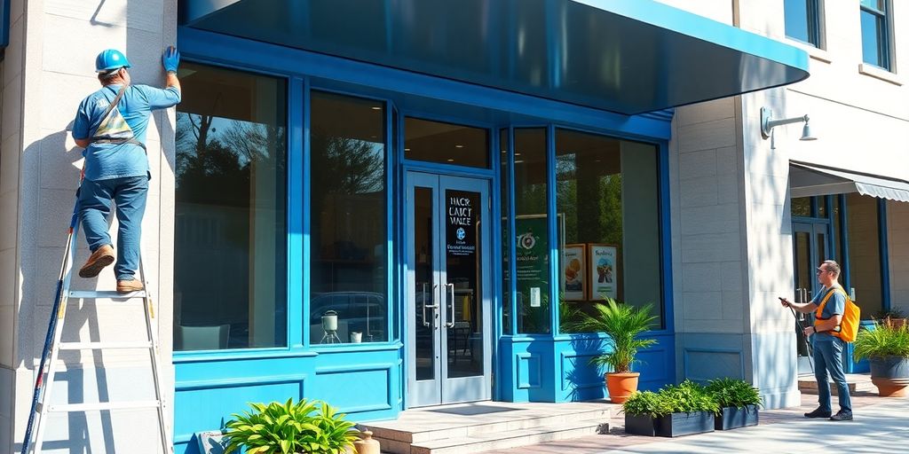
Seamless Sign Installation Services
Okay, so you’ve got this awesome new sign, right? But getting it up and looking perfect? That’s where the real magic happens. It’s not just about slapping it on a wall; it’s about making sure it stays there, looks great, and follows all the rules. Here’s the lowdown on how we make sign installation smooth and stress-free.
Conducting Comprehensive Site Surveys
First things first, we need to see where this sign is going. A site survey is like a doctor’s checkup for your building. We’re looking at everything: wall structure, electrical access, viewing angles, potential obstructions. This step helps us avoid surprises later on. We measure, we photograph, and we plan. It’s all about getting the details right from the start. This also helps us determine the best type of illuminated signs for your business.
Navigating Permitting And Compliance Requirements
Ugh, permits. Nobody loves them, but they’re a must. Every city has its own rules about sign size, placement, and lighting. We handle all that paperwork for you. We know the local codes, and we’ll make sure your sign is 100% compliant. Think of us as your permit sherpas, guiding you through the red tape. We’ll deal with the city so you don’t have to. This ensures your property management signs are up to code.
Coordinating Professional Installation Teams
Our installation crews are pros. They’ve got the tools, the experience, and the know-how to install any sign, big or small. They’re trained to work safely and efficiently, minimizing disruption to your business. Plus, they’re sticklers for detail. They won’t leave until your sign is perfectly aligned, securely mounted, and looking its absolute best. We also offer sign repair services to keep your signs in top condition.
Proper sign installation is more than just aesthetics; it’s about safety, compliance, and making a lasting impression. A poorly installed sign can be a hazard and reflect badly on your brand. That’s why we take it seriously.
Here’s a quick checklist we use to ensure a smooth installation:
- Confirm all permits are approved.
- Double-check measurements and sign placement.
- Verify electrical connections (if applicable).
- Conduct a final inspection for quality and safety.
Personalized Branding Strategies At Your Sign Shop
Customizing Logos For Maximum Impact
Your logo is the face of your business, and your sign shop can play a huge role in making it shine. We don’t just slap your existing logo on a sign; we work with you to optimize it for physical display. This might mean adjusting colors for better visibility, simplifying complex designs for readability at a distance, or even suggesting subtle tweaks to make it more memorable. Think about it – a logo that looks great on a business card might not translate well to a large outdoor sign. We make sure it does.
Aligning Signage With Online Presence
In today’s world, your physical and digital presence need to be in sync. Your signage should not only reflect your brand’s identity but also complement your website and social media. This means using consistent colors, fonts, and messaging across all platforms.
Here’s how we help:
- Ensuring your sign’s design matches your website’s aesthetic.
- Incorporating your social media handles into your signage.
- Using QR codes to drive traffic to your online platforms.
It’s about creating a cohesive brand experience, so customers instantly recognize you, whether they’re walking past your store or browsing your website.
Tailoring Designs To Your Target Audience
One size doesn’t fit all when it comes to signage. A playful, colorful sign might be perfect for a children’s boutique, but it would be completely out of place for a law firm. We take the time to understand your target audience and create designs that appeal to them. This involves considering factors like age, gender, income level, and lifestyle. For example, a modern, minimalist design might attract younger, tech-savvy customers, while a more traditional design might resonate with an older demographic. It’s all about speaking their language and creating a sign that grabs their attention for the right reasons.
## Conclusion
After everything we’ve covered, a good sign really can make you stand out. From swapping out old letters to adding lights that pop at night, you’ve got plenty of choices. A monument sign by the road or simple channel letters above the door—either one can help. Getting the hang of install and keeping your signs clean matters, too. Don’t let burnt-out bulbs or chipped paint send folks packing. Your storefront is the first hello—make it count. So go ahead, give your facade a fresh look and watch people stop, stare, and walk right in.
Frequently Asked Questions
Why should I pick weather-resistant materials for my sign?
Weather-resistant materials last longer when rain, sun, or wind hit your sign. This means less fading, warping, or cracking over time.
How can I make my outdoor sign easy to read from far away?
Use bold letters and high-contrast colors so words pop. Keep the message short and clear so drivers or walkers spot it quickly.
What’s the best way to keep my sign looking fresh?
Wipe it down with a soft cloth and mild soap every few months. Fix small scratches or loose parts right away to stop bigger damage.
Do I need a permit to install a sign outside my business?
Often, yes. Check with your city or county office to see what rules apply and fill out any forms before you start.
Can I match my new sign to my website or social media?
Sure! Use the same colors, fonts, and logo shape you have online. This makes your brand easy to recognize anywhere.
Are LED-lit signs a good choice for saving energy?
Yes. LED lights use much less power than old bulbs. They also stay bright longer and cut down on electricity bills.